
Why Chatbot UI Design Is the Difference Between 5% and 50% Engagement
You can build the smartest AI chatbot in the world, but if the interface looks like a 2010 popup ad, visitors will close it before the first message loads. Chatbot UI design is the gatekeeper between your AI investment and actual user engagement.
The data backs this up. A study by the Baymard Institute found that conversational interfaces with optimized UI design achieve 3-10x higher engagement rates than poorly designed ones with identical AI capabilities. The AI under the hood is the same - only the interface changes.
The UI Elements That Impact Conversion
| UI Element | Impact on Engagement | Common Mistake |
|---|---|---|
| Widget launcher (button) | First impression - determines if user clicks at all | Too small, wrong color, hidden by other elements |
| Welcome message | Sets expectations - 40% of users decide to engage or leave here | Generic, too long, not relevant to page |
| Message bubbles | Readability - affects how long users stay in conversation | Too wide, no visual hierarchy, wall of text |
| Quick reply buttons | Reduces friction - 2-3x faster than typing | Too many options, unclear labels, tiny tap targets |
| Input area | Signals what actions are available | Ambiguous placeholder text, missing send button |
| Typing indicator | Manages expectations during AI processing | Absent (feels broken) or too long (feels slow) |
| Mobile responsiveness | 60-70% of traffic - non-negotiable | Desktop-only design, tiny buttons, scrolling issues |
Each of these elements seems minor in isolation. Together, they determine whether your chatbot achieves a 5% engagement rate (passive, poorly designed) or a 50% engagement rate (proactive, well-designed). Let's optimize every one of them.
Best Practices 1-3: Widget Launcher, Position & Proactive Messages
1. Widget Launcher: Design the Click-Worthy Button
The launcher button is the single most important UI element - if nobody clicks it, nothing else matters. Follow these specifications:
- Size: 56-64px diameter on desktop, 48-56px on mobile. Research by NNGroup shows that tap targets below 44px cause 25% miss rates on mobile.
- Color: Use your brand's primary or accent color - it should stand out against your site's background without clashing. High contrast increases click rates by 20-30%.
- Icon: A friendly chat bubble icon is universally understood. Adding a small avatar (human face or brand mascot) increases click rates by 15% compared to abstract icons.
- Animation: A subtle bounce or pulse animation when the page loads draws attention without being annoying. Limit to 2-3 repetitions, then stop. Infinite animation feels like a desperate pop-up.
- Badge/counter: Show an unread message indicator ("1" badge) if the bot has a proactive greeting. This mimics familiar messaging app patterns and increases click-through by 18%.
2. Widget Position: Bottom-Right, Always
89% of chat widgets are positioned in the bottom-right corner. Users expect it there. Placing your widget elsewhere (bottom-left, sidebar, top bar) confuses users and reduces engagement by 25-40%. The only exception: right-to-left languages (Arabic, Hebrew) where bottom-left may be more natural.
Ensure the widget doesn't overlap critical page elements:
- Navigation menus and hamburger buttons
- Call-to-action buttons ("Buy Now", "Sign Up")
- Cookie consent banners (reposition the banner, not the widget)
- Scroll-to-top buttons (move them to the left side)
3. Proactive Messages: Time and Relevance Matter
A proactive greeting increases engagement 3-5x over a passive icon. But timing and relevance are everything:
- Delay: 5-10 seconds after page load. Under 3 seconds feels invasive (the visitor hasn't even read the page yet). Over 15 seconds and many visitors have already left.
- Frequency: Show once per session. Don't re-trigger on every page load - that becomes a nag popup.
- Relevance: Match the greeting to the page. "Need help choosing a plan?" on pricing vs. "Have a question about this product?" on a product page. Page-specific greetings convert 25-35% better than generic ones.
- Dismissibility: Always let users close the proactive message without opening the full chat. A small X button is essential. Users who dismiss should not see the message again for at least 24 hours.
Configure all of these from the Conferbot dashboard without touching code.
Best Practices 4-7: Message Design, Quick Replies & Typing Indicators
4. Message Bubbles: Readability Over Everything
Every message your chatbot sends should be scannable in under 3 seconds. This means:
- Max width: 280-320px for desktop, 75% of screen width for mobile. Full-width messages look like error alerts, not conversations.
- Line length: 50-65 characters per line. Longer lines reduce reading speed by 20%.
- Paragraph length: 2-3 sentences maximum per bubble. If you need more content, split into multiple bubbles with a 300-500ms delay between each (simulates natural typing pace).
- Visual distinction: Bot messages and user messages should have clearly different colors and alignment (bot = left/light, user = right/colored). Never use the same style for both - it's confusing.
- Typography: 14-16px font size minimum. System fonts (Inter, -apple-system, Segoe UI) for clarity. Never use decorative fonts in chat interfaces.
5. Quick Reply Buttons: Reduce Friction, Increase Completion
Quick reply buttons (predefined response options users can tap instead of typing) are the highest-impact UI element for conversion. They reduce response friction by 70% and increase flow completion rates by 40-60%.
Design rules for quick replies:
- Number of options: 2-4 is ideal. 5+ causes decision paralysis. If you need more options, use a scrollable horizontal carousel.
- Label length: 1-4 words per button. "Get a Quote" works. "I would like to receive a quotation for your services" does not.
- Tap target size: Minimum 44px height, 12px padding. On mobile, small buttons cause mis-taps and frustration.
- Visual style: Outlined buttons (border only) for options, filled buttons for the primary action. This creates visual hierarchy.
- Always include a free-text option: Add a hint like "Or type your own question" below the buttons. Some users want to ask something not covered by the predefined options.
6. Typing Indicators: Manage the Wait
When your AI takes 1-3 seconds to generate a response, show a typing indicator (the three animated dots). This serves two psychological functions:
- Expectation management: Without a typing indicator, users think the chat is broken after 2 seconds. With one, they'll wait 5-8 seconds comfortably.
- Humanization: The typing indicator mimics human conversation patterns, making AI responses feel more natural.
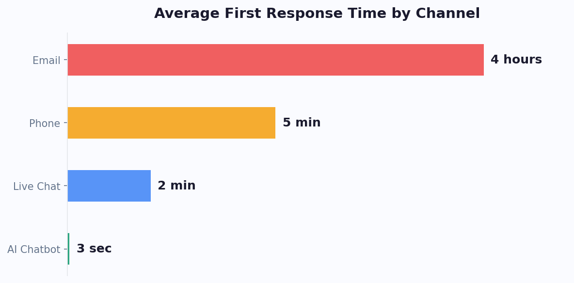
Rules: Show the indicator within 200ms of the user's message. If processing takes longer than 5 seconds, add a brief text status ("Searching for information..."). Never let the indicator show for more than 10 seconds without feedback.
7. Rich Media: Use Sparingly and Purposefully
Rich media elements - images, carousels, videos, maps - increase engagement when used purposefully. But overuse makes the chat feel like a cluttered web page.
- Image carousels: Perfect for showing product options, property listings, or plan comparisons. Limit to 3-5 cards per carousel.
- Images: Use for product photos, charts, or screenshots. Compress to under 100KB for fast loading. Always include alt text.
- Videos: Embed only when the user explicitly requests a demo or tutorial. Auto-playing video in a chat window is jarring.
- Links: Open in a new tab, never navigate away from the current page. The chat should remain accessible after clicking a link.
Best Practices 8-10: Mobile-First Design (60-70% of Your Traffic)
8. Full-Screen Mobile Chat
On desktop, the chatbot widget is a floating panel in the corner - typically 380px wide and 550px tall. This format fails catastrophically on mobile. A 380px-wide floating panel on a 375px-wide phone screen means overflow, scroll conflicts, and an unusable interface.
The solution: Switch to full-screen mode on screens under 768px wide. When the user opens the chat on mobile, it takes over the entire viewport - just like opening WhatsApp or iMessage. This provides:
- Full-width message bubbles that are readable
- Properly sized quick reply buttons
- A keyboard that doesn't obscure the conversation
- Native-feeling scroll behavior
- A clear back/close button to return to the site
Most chatbot platforms including Conferbot handle the desktop-to-mobile transition automatically. Test on actual devices (not just browser dev tools) to catch edge cases.
9. Touch-Friendly Everything
Mobile users tap with thumbs, not mouse cursors. Every interactive element needs to accommodate this:
- Minimum tap target: 44x44px (Apple HIG) or 48x48dp (Material Design). This applies to buttons, links, the close button, and the send button.
- Spacing between targets: Minimum 8px gap between tappable elements to prevent mis-taps.
- Input field: The message input should be at least 44px tall with clear visual boundaries. Add a distinct send button (not just an icon that blends in).
- Scroll behavior: The chat should scroll naturally with momentum. When a new message arrives, auto-scroll to the bottom. But if the user has scrolled up to re-read earlier messages, don't force them back down.
10. Keyboard and Viewport Management
The mobile keyboard takes up 40-50% of the screen. When it appears, the chat interface must adapt:
- Input field stays visible: The message input should remain above the keyboard at all times. If the input slides behind the keyboard, users can't see what they're typing.
- Conversation stays readable: The message area should shrink to accommodate the keyboard, keeping the most recent messages visible.
- Keyboard type matters: When asking for an email, trigger the email keyboard (with @ symbol). For phone numbers, trigger the numeric keypad. For general text, use the default keyboard. This reduces input errors by 30%.
- Orientation: Test in both portrait and landscape. Some users rotate their phones while typing - the chat interface should reflow gracefully.
These mobile details seem trivial individually, but collectively they're the difference between a chatbot that feels native and one that feels like a broken web popup. Since 60-70% of your visitors are on mobile, this is where the majority of your conversations happen.
Best Practices 11-12: Conversation Flow Architecture
11. Progressive Disclosure: Ask Less, Convert More
The most common chatbot design mistake is asking too many questions upfront. Every additional question in your flow reduces completion rates by 5-10%. A 10-question flow converts 50-70% fewer users than a 4-question flow.
The principle: Ask only what's needed for the next step. Not what's nice to have. Not what sales wants. What's needed for the immediate next action.
Example - Lead qualification flow:
| Question Order | Bad Design (12 questions) | Good Design (4 questions) |
|---|---|---|
| 1 | What's your name? | What are you looking for? [Quick replies: Demo / Pricing / Support] |
| 2 | What's your company name? | What's your biggest challenge right now? [Quick replies: 3 options] |
| 3 | What's your role? | Great - I can set up a personalized demo. What's the best email? [Input] |
| 4 | What industry are you in? | Perfect, you're all set! Check your email for next steps. [CTA button] |
| 5-12 | Company size, budget, timeline, current tools, decision makers... | - (Sales asks remaining questions on the call) |
The good design captures intent and email in 4 steps. Sales gets the lead and qualifies further on the demo call - where the prospect is already invested. The bad design tries to do sales' job and loses 70% of visitors in the process.
12. Conversational Branching: Guide Without Trapping
Your chatbot should feel like a helpful conversation, not a phone tree from the 1990s. Key principles:
- Allow escape at every step: Users should be able to type "I want to talk to someone" or "go back" at any point. The bot should recognize these intents and respond appropriately - either connecting to live chat or returning to the previous step.
- Support topic switching: If a user is in the middle of a support flow and asks a pricing question, handle it. Don't force them to finish the current flow first. AI-powered bots using natural language processing handle this naturally.
- Avoid dead ends: Every conversation path should end with a clear next step - a CTA, a handoff, or at minimum a "Is there anything else I can help with?" prompt. Never leave the user staring at a final message with nothing to do.
- Preserve context: If a user provides their email early in the conversation, don't ask for it again later. If they mentioned they're interested in "Plan B", reference that in subsequent messages. Context awareness makes the bot feel intelligent.
Map your conversation flows visually before building them. Tools like the Conferbot visual flow builder let you see branching paths and identify dead ends before users encounter them.
Best Practices 13-14: Accessibility & Inclusive Design
13. WCAG Compliance: Chatbots Must Be Accessible
Web accessibility isn't optional - it's a legal requirement in many jurisdictions (ADA in the US, EAA in the EU) and a moral imperative. Chatbot widgets are frequently the least accessible element on otherwise compliant websites. Here's how to fix that.
Color contrast: All text must meet WCAG 2.1 AA contrast ratios - 4.5:1 for normal text, 3:1 for large text (18px+). This applies to message text, button labels, placeholder text, and timestamps. Use a contrast checker tool to verify. Common failures: light gray text on white backgrounds, low-contrast button labels.
Keyboard navigation: Every element in the chatbot must be reachable and operable via keyboard (Tab to navigate, Enter to activate, Escape to close). The tab order should follow a logical sequence: close button → message area → quick replies → input field → send button.
Screen reader support: Add proper ARIA labels and roles:
- Widget launcher:
aria-label="Open chat",role="button" - Chat window:
role="dialog",aria-label="Chat with [brand name]" - Message area:
role="log",aria-live="polite"(announces new messages) - Each message:
role="article"with sender identification - Quick replies:
role="group"witharia-label="Response options"
Focus management: When the chat opens, focus should move to the input field or the first interactive element. When the chat closes, focus should return to the launcher button. Trapped focus inside the modal prevents users from accidentally interacting with the page behind it.
14. Inclusive Language and Interaction Design
Accessible design goes beyond technical compliance:
- Don't rely on color alone: If error messages are red, also include an icon and text description. Colorblind users (8% of men) won't distinguish red from green messages.
- Provide text alternatives for images: Every image sent by the chatbot needs descriptive alt text. Rich media carousels must have accessible labels for each card.
- Support text resizing: The chat interface should remain usable when browser text size is increased to 200%. Fixed pixel sizes that don't scale break for low-vision users.
- Avoid time-based interactions: Don't auto-close messages, remove quick reply options after a timeout, or require users to respond within a time limit. Users with motor or cognitive disabilities need more time.
- Provide a non-chat alternative: Some users can't or won't use a chat interface. Always make your phone number and email address accessible on the page alongside the chatbot. The chatbot augments other channels - it doesn't replace them.
Testing tip: Navigate your entire chatbot using only the keyboard (no mouse). Then test with a screen reader (VoiceOver on Mac, NVDA on Windows). If you can complete a conversation both ways, your chatbot is accessible to the vast majority of users.
Best Practice 15: Brand Personality - Make Your Bot Memorable
15. Consistent Brand Voice That Builds Trust
Your chatbot speaks on behalf of your brand thousands of times per month. Every message is a branding opportunity - or a branding liability. Defining a clear chatbot personality ensures consistency and builds the trust that converts visitors into customers.
Define Your Bot's Personality in 4 Dimensions
| Dimension | Formal (B2B/Finance/Law) | Friendly (SaaS/E-commerce) | Playful (Consumer/Gaming) |
|---|---|---|---|
| Greeting | "Good afternoon. How may I assist you?" | "Hey there! What can I help you with?" | "Yo! Ready to find something awesome?" |
| Error handling | "I apologize, I wasn't able to find that. Let me connect you with a specialist." | "Hmm, I'm not sure about that one. Let me get someone who can help!" | "Oops, that stumped me! Let me grab a human brain." |
| Confirmations | "Your appointment has been confirmed for March 15 at 2:00 PM." | "You're all set! See you March 15 at 2 PM." | "Booked! March 15, 2 PM. You're gonna love it!" |
| Sign-off | "Thank you for your time. Is there anything else I can assist you with?" | "Anything else I can help with? I'm here if you need me!" | "Need anything else? I'm not going anywhere!" |
Name and Avatar
Give your chatbot a name and face. Research by Stanford's Clifford Nass found that named interfaces with avatars receive 30% more engagement and 25% higher trust ratings than anonymous ones. Options:
- Human name + photo: "Alex from [Company]" - highest trust, but sets high expectations for human-like responses
- Bot name + mascot: "Botly" with a custom character - fun, sets appropriate expectations for AI
- Brand name + logo: "[Company] Assistant" - professional, clear it's automated
Whichever you choose, be transparent. If it's a bot, say so in the first message: "I'm [Name], [Company]'s AI assistant. I can help with [X, Y, Z] or connect you with a team member." Honesty about being AI actually increases trust - users appreciate transparency and adjust their expectations accordingly.
Tone Consistency Across Channels
If your chatbot sounds friendly on your website but robotic on WhatsApp and formal on Messenger, you have a brand consistency problem. The personality should adapt slightly to channel norms (WhatsApp is inherently more casual than a website widget) but maintain the same core voice. Build your chatbot once in the Conferbot builder with a defined personality, and it carries across all channels automatically.
Measuring Personality Impact
Track these metrics to see if your chatbot's personality is working:
- Engagement rate: Does a name/avatar change increase click-through?
- Conversation length: Do users have longer (more engaged) conversations with the personality-driven version?
- CSAT scores: Do users rate the experience higher?
- Completion rates: Does the right tone reduce drop-offs?
Use Conferbot analytics to A/B test different personalities. Even small changes - like switching from "Hello" to "Hey!" - can shift engagement rates by 10-15% depending on your audience. For deeper design guidance, see our blog on conversation flow templates and personalization strategies.
Chatbot UI Performance Benchmarks and Testing Framework
Knowing what to design is half the battle. Knowing whether your design is working requires a systematic measurement framework. Research from the Nielsen Norman Group on chatbot usability establishes clear benchmarks for evaluating chatbot UI performance across industries.
Key UI Performance Metrics
| Metric | Poor | Average | Excellent | How to Measure |
|---|---|---|---|---|
| Widget click-through rate | <2% | 3-5% | 7-12% | Clicks on launcher / unique visitors |
| Conversation start rate | <40% | 50-65% | 70-85% | First user message / widget opens |
| Flow completion rate | <30% | 40-60% | 65-85% | Users who reach end / users who started |
| Avg. messages per session | 1-2 | 3-5 | 6-10 | Total messages / sessions |
| Mobile engagement gap | >30% lower than desktop | 10-20% lower | Within 5% of desktop | Mobile rate / Desktop rate |
| Time to first user response | >15 seconds | 5-10 seconds | <5 seconds | Time from bot message to user tap/type |
A/B Testing Framework for UI Elements
According to HubSpot's conversion optimization research, systematic A/B testing of chatbot UI elements yields an average 23% improvement in engagement within the first three months. Here is the testing priority order - start with the highest-impact element and work down:
- Proactive message copy and timing (highest impact, easiest to test): Test different delay values (5s vs 8s vs 12s), different message copy, and different triggers. This single variable often produces 30-50% engagement differences.
- Widget launcher design: Test color, size, animation (pulse vs bounce vs static), and icon (chat bubble vs avatar vs brand logo). Run each test for at least 1,000 unique visitors.
- Welcome message structure: Test quick-reply options vs free-text prompt. Test 2 buttons vs 3 buttons vs 4 buttons. Test value-first vs question-first messaging.
- Quick reply button labels: Short labels vs descriptive labels. Emoji-included vs text-only. Action-oriented vs question-oriented.
- Conversation length: Test 3-step flows vs 5-step flows for the same outcome. Measure completion rate and lead quality for each.
Industry-Specific UI Patterns That Work
UI design that converts in ecommerce may fail in healthcare, and vice versa. Research from Gartner's customer experience studies shows that industry context significantly influences which UI patterns drive engagement:
- Ecommerce: Product carousels, visual quick replies with product thumbnails, prominent "Shop" CTA, persistent cart indicator. Informal tone. See our ecommerce chatbot guide for specific patterns.
- Healthcare: Calming color palette (soft blues/greens), formal tone, prominent privacy notice, clear escalation to clinical staff, HIPAA-compliant data handling indicators. For implementation details, see our healthcare chatbot guide.
- B2B SaaS: Clean, minimal design matching the product aesthetic. Lead with value (ROI calculator, assessment) rather than data collection. Calendar integration for instant meeting booking.
- Financial Services: Trust signals (security badges, compliance certifications), verification steps before showing account data, formal language, minimal use of emojis or casual elements.
- Education: Friendly but professional tone, guided pathways for different user types (prospective student vs current student vs parent), multilingual support indicators.
Common UI Audit Checklist
Run this audit on your chatbot quarterly to catch regression and identify optimization opportunities. Based on G2's chatbot platform reviews and user satisfaction research, these items correlate most strongly with positive user outcomes:
- Launcher is visible within 2 seconds of page load (no layout shift hiding it)
- Proactive message appears exactly once per session with relevant, page-specific copy
- All quick reply buttons are readable without horizontal scrolling on mobile
- Typing indicator appears within 200ms of user message
- No message exceeds 60 words or 3 sentences per bubble
- Full keyboard navigation is functional (Tab, Enter, Escape)
- Color contrast meets WCAG 2.1 AA on all text elements
- Mobile full-screen mode activates below 768px viewport width
- Send button is distinct and tappable (minimum 44x44px)
- Every conversation path ends with a next step (never a dead end)
For a complete walkthrough of building optimized chatbot flows, see our guide to building a chatbot without coding. To understand how UI design impacts broader lead generation strategy, explore our lead generation chatbot playbook.
Was this article helpful?
Build and deploy in 10 minutes. No coding needed.
15 Chatbot UI Design Best Practices That Actually Convert (2026) FAQ
Everything you need to know about chatbots for 15 chatbot ui design best practices that actually convert (2026).
About the Author
The Conferbot team writes about building, deploying, and improving AI chatbots.
View all articles

