What makes a good chatbot window UI?
A good chat window is legible at a glance, obviously interactive, and honest about what it can do. Almost every failure traces back to one of those three: text that is hard to read, an interface that hides what to do next, or an opening line that promises more than the bot delivers.
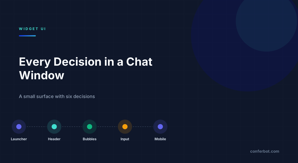
The window itself is a small surface - roughly 380px wide by 550-600px tall on desktop, full screen on mobile - but it contains a dozen distinct design decisions: the launcher, the header, the message area, the input, proactive triggers, mobile behaviour, dark mode, branding, persona, load performance, and accessibility. Each has a wrong answer that quietly costs conversations, and most of them are configuration rather than code - meaning a settings pass through your live chat setup, not a development project. This guide goes through them one at a time.
It is worth separating this from conversation design up front. What the bot says and in what order is a flow design question; this guide is about the container the conversation happens inside - the pixels, not the script. The two interact constantly (a great flow inside a window with 3:1 contrast still loses people), but they are solved with different tools and, on most platforms, by different people. Treating window design as purely cosmetic is the single biggest reason otherwise well-written flows underperform.
Eight chat window patterns, side by side
Every decision above is easier to judge against something you can see. These are eight chat-window patterns drawn to the same scale, so the differences are structural rather than cosmetic. None of them is universally right - each solves a different problem, and the note under each says which.
The default bubble widget. A rounded card anchored bottom-right. It is the pattern users recognise fastest, which is exactly why it also disappears into the background on a busy page.
Monochrome and quiet. Dropping brand colour from the window and keeping it only on the launcher suits high-consideration purchases where a bright widget reads as a pop-up ad.
Structured cards instead of prose. When the answer is data, a card outperforms a sentence: it is scannable, and it survives being screenshotted and forwarded.
Inline pickers. Dates, times and quantities collected inside the window rather than by bouncing the visitor to a booking page - the handoff is where most booking flows lose people.
Search-first, chat-second. Leading with articles deflects the repeat questions and keeps the conversation for the ones that genuinely need it. Best where support volume is the problem.
Visible handoff. Marking the moment a person takes over is the single change that most reduces the “I could not reach a human” complaint, even when the wait is identical.
Progress made explicit. A visible step counter is what makes a five-question qualifier feel finite. Without it, question three is where people close the window.
Latency made honest. A typing indicator buys roughly a second of patience. It does not buy five - past that the right answer is to say what is happening, not to keep animating.
Two things are worth noticing across the set. The frame barely changes - header, transcript, composer - because that is the convention users arrive with, and breaking it costs more than it gains. What changes is what fills the transcript: bubbles, cards, pickers, progress. That is where a window stops looking like everyone else's and starts matching the job it does.
The launcher: the only element most visitors see
Most people never open your chat. The launcher is therefore doing more work than the entire conversation behind it, and it is worth treating as a distinct design problem rather than an afterthought bolted onto the corner of the page.
The decisions, in order of impact:
- Position. Bottom-right is the convention and conventions reduce hesitation. Bottom-left is legitimate if a cart, cookie bar or back-to-top button already occupies the right - competing for the same corner is worse than being unconventional.
- Offset. The single most common implementation bug is a launcher that overlaps a sticky footer or a mobile navigation bar. Check it against your own site, not against a blank demo page - see chat widget not showing on website for the most common ways this goes wrong in practice.
- Size. Large enough to be an obvious tap target, and no larger. Oversized launchers read as advertising rather than a support tool - the accessibility section below covers the specific minimum sizes to design around.
- Icon versus image. A chat glyph is instantly legible. A brand mark is not, unless you are already famous. If you use a custom image, it still has to say "this opens a conversation."
- Call-to-action label. A short label beside the icon - "Need help?" - reliably lifts opens over a bare circle, at the cost of screen real estate.
Resist animation that loops. A pulse on first load is a nudge; a permanent bounce is noise people learn to ignore, and on mobile it drains battery for nothing in return.
Worth testing rather than assuming: the launcher's copy and icon are exactly the kind of high-leverage, low-effort change that suits a proper A/B test once your traffic supports one, since the entire visitor population sees the launcher, unlike a message buried three steps into a flow. A launcher label change is cheap to ship and easy to measure against open rate, which makes it a better first experiment than most conversation-level changes.
Header: identity and the exit
The header answers "who am I talking to" and "how do I leave." Both matter more than the small amount of vertical space they occupy.
- Name the bot honestly. "Support Bot" sets accurate expectations. A human first name on an automated agent buys a moment of warmth and then a moment of betrayal when it cannot help - see the persona section below for how this connects to tone more broadly.
- Say whether a human is available. The single most useful piece of header copy is whether escalation exists. "We reply in minutes, 9-5 GMT" prevents the frustration of discovering at 11pm that nobody is there.
- Keep close obvious. A visible close control, not a gesture. Trapping people is the fastest way to lose them permanently, and it undermines trust in every future chat they might have opened with you.
- Contrast the header colour properly. Brand colour headers frequently fail contrast against white text. Check the actual ratio rather than trusting that it looks fine on your monitor - see the accessibility section for the exact threshold.
A tagline is optional and usually earns its space only when it clarifies scope - "Order and delivery questions" is useful; "We are here for you!" is not, because it tells the visitor nothing about what the bot can actually do.
The header is also where most branding disputes happen internally, because it is the most visually prominent piece of real estate in the window. Marketing wants the brand colour at full saturation; support wants maximum legibility. Both are right, and the resolution is almost always the same: use the brand colour as the header background, but let text colour and weight be decided by the contrast check rather than by the brand book - a header that fails contrast is not "on brand," it is illegible, and no amount of brand consistency offsets that. See the chat widget glossary entry for how this component fits into the wider terminology used across this guide.
Message bubbles: legibility before personality
This is where most of the reading happens, so it is where restraint pays off more than anywhere else in the window.
| Property | Safe default | Why |
|---|---|---|
| Bot vs user distinction | Different colour and alignment | Alignment alone fails for colour-blind users; colour alone fails on small screens |
| Body size | 15-16px | Below 14px fails on mobile; above 17px wastes a narrow column |
| Corner radius | 8-16px | Fully rounded pills break badly on multi-line text |
| Max width | ~75% of the column | Full-width bubbles remove the visual cue of who is speaking |
| Message length | Under ~60 words | Long paragraphs in a narrow column read as a wall and get skipped |
| Background | Solid, low contrast | Image and gradient backgrounds routinely destroy text contrast |
If a message needs more than sixty words, it usually needs to become two messages or a link out to a fuller answer. Splitting also lets you show a typing indicator between them, which reads as considered rather than dumped on the visitor all at once. This same restraint applies to how a bot's personality comes through in wording - see chatbot copywriting guide for how to keep tone consistent without padding every message.
Input: buttons versus the text box
The input area silently decides your completion rate more than almost any other single element in the window.
Buttons and quick replies raise completion because they remove the burden of composing an answer, work far better on mobile, and constrain input to values your flow can actually handle. Their cost is that they cannot capture anything you did not anticipate - see the visual chatbot builder guide for how choice nodes and free-text nodes fit into the underlying flow.
Free text collects richer information and is essential for open questions, but every free-text field is a chance for the user to say something the flow cannot parse, which is where a well-designed fallback matters.
The reliable pattern is buttons with an escape hatch: offer three to five options, and leave the text box available for anyone whose situation is not on the list. Hiding the text input entirely is what makes a bot feel like a phone tree.
Three details that matter more than they look:
- Keep the input visible while the bot types. Disabling it mid-conversation makes the interface feel frozen rather than merely busy.
- Show a typing indicator for anything over about half a second, and be honest with its duration - artificially slow typing to seem human is irritating once a visitor notices it.
- Support Enter to send on desktop and keep the send button large enough to tap reliably on mobile, per the target-size guidance in the accessibility section below.
One more input decision worth naming explicitly: what happens to a button's label once it has been clicked. Replacing the row of buttons with the visitor's own selection, styled as their sent message, closes the loop visually and confirms the choice registered - leaving the buttons on screen after a click, unchanged, is a common source of visitors clicking a second option by mistake, unsure whether the first click actually did anything. This is a small detail that shows up constantly in usability recordings and almost never in a static design mockup, which is exactly why it gets missed.
Proactive messages: invitations, not interruptions
A proactive message - the widget opening itself with a first line, rather than waiting to be clicked - is a real lever on open rates, and also the fastest way to make a chat feel like a pop-up ad if the timing is wrong.
- Time-delay triggers (open after 15-30 seconds on a page) work well on content-heavy pages where a visitor has had time to actually read something before being interrupted.
- Scroll-depth or exit-intent triggers fit pages where the useful moment to offer help is closer to the point someone is about to leave, rather than the moment they arrive.
- Page-specific triggers - a different opening line on a pricing page versus a documentation page - tend to outperform one generic message everywhere, because the opening line can speak directly to what the visitor is already looking at.
The failure mode to avoid is firing a proactive message on every page, every visit, with no delay - which reads as aggressive rather than helpful and trains repeat visitors to dismiss the widget on sight. One well-placed trigger per session, tied to a page or a moment that actually signals interest, outperforms a widget that opens itself constantly.
Mobile: a different design, not a smaller one
Mobile devices account for the majority of web traffic worldwide - 53.37% of global page views in July 2026, against 46.63% for desktop, according to StatCounter Global Stats - so mobile chat behaviour is not an edge case to handle later; for most sites it is the majority experience from day one.
| Property | Desktop | Mobile |
|---|---|---|
| Window type | Floating panel, ~380px wide | Full screen |
| Background scroll | Page remains scrollable behind the panel | Blocked while the chat is open, since it is full screen |
| Keyboard behaviour | Rarely an issue | Consumes up to half the viewport - test with it open |
| Safe areas | Not applicable | Must respect notches and home-indicator bars |
Beyond the table, four rules hold up consistently: never block page scroll behind an open chat unless the chat is genuinely full screen; keep tap targets and spacing generous, since packed quick-reply chips are the most common mis-tap source; respect safe areas on notched devices or your close button ends up under the system UI; and test on a real mid-range Android device, not only a desktop browser's responsive mode. The gap between those two is where most launch-day bugs live.
Given that mobile carries the majority of traffic on most sites, treat it as the primary design target and desktop as the secondary case, not the other way around. A common and costly mistake is designing and reviewing the desktop floating panel first, getting sign-off on it, and only then checking how it behaves full screen on a phone - by which point the header copy, button count and message lengths have all been tuned for a wider, calmer surface than most visitors will actually see. See chatbot UI design best practices for a broader set of patterns beyond the window itself.
Dark mode and matching your site's theme
A chat window styled only for a light background looks visibly out of place - and often has contrast problems - the moment it sits on a page using a dark theme, whether that theme is the site's design or the visitor's own operating-system preference.
Two separate things are worth distinguishing: following the site's theme (a documentation site with a dark-mode toggle should have a chat window that switches with it) and following the visitor's system preference via CSS media queries, independent of what the site itself does. The safer default is to inherit the site's theme rather than the OS preference, since a widget that goes dark while the surrounding page stays light reads as a bug, not a feature. Whichever you choose, re-check contrast ratios in both modes rather than assuming a palette that passes in light mode also passes inverted - dark-on-dark and light-on-light failures are both common when a theme is inverted mechanically instead of being designed for both states.
Persona and tone: what the header and bubbles say together
Visual design decides whether the window is easy to read; persona decides whether people trust what it says once they can read it. The two are connected more tightly than they look - a warm, first-name persona paired with a header that never mentions human availability sets up exactly the disappointment the header section above warns about.
A consistent chatbot persona means the name, the avatar, the header copy and the message tone all agree with each other and with what the bot can actually do. A support bot that introduces itself formally and then uses slang mid-conversation reads as inconsistent in a way visitors notice even if they cannot articulate why. See the copywriting guide for wording patterns, and personalization guide for how far to take name and context-based tailoring before it starts feeling intrusive rather than helpful.
Branding: how much of the window is actually yours
Most chat platforms style the launcher, header and bubble colours as configuration, but the branding footer - the small "powered by" line at the bottom of the window - is usually locked to a specific plan tier rather than being freely editable everywhere.
If a fully white-labelled window matters to you - no visible third-party branding, a custom domain for hosted chat links - confirm it against your actual plan rather than the general marketing page, the same way you would confirm channel availability when evaluating a flow builder. See white-label and custom domains for what full removal typically includes. For most teams the default branding footer is a minor detail; for an agency reselling chat under its own name to clients, it is a hard requirement worth checking before signing up rather than after building the first bot. The same applies to hosted chat links shared outside the widget itself - a support email that links to a chat conversation on a generic third-party subdomain undercuts a carefully designed window the moment the visitor leaves your site to reach it, which is exactly the gap a custom domain closes.
Load performance: the part nobody sees, until it's slow
A chat widget is third-party script loading on every page of your site, and a heavy one measurably slows the page around it - which is a strange kind of self-defeating outcome for a tool meant to help visitors, not frustrate them before they even reach it.
- Load it asynchronously, so the widget script never blocks the rest of the page from rendering.
- Lazy-load the full conversation UI until the launcher is actually clicked - only the small launcher bundle needs to be present on first paint.
- Watch the total script weight, especially if the widget bundles avatar images, custom fonts, or animation libraries that are not essential to the core conversation.
None of this is visible in a design review, which is exactly why it gets skipped. It shows up later as a slow Largest Contentful Paint score or a support ticket about the site "feeling laggy" that nobody immediately connects to the chat widget - worth checking explicitly rather than assuming a professional-looking widget is automatically a lightweight one. Once the widget is live, treat its performance as an ongoing metric rather than a one-time launch check: pair it with the open rate and completion numbers in your analytics dashboard, since a slow-loading widget quietly suppresses open rate in a way that is easy to misattribute to the launcher design instead of the load time.
Accessibility is mostly free if you do it first
Retrofitting accessibility into a chat window is painful; building it in from the start costs almost nothing, and several of the requirements below have precise, testable thresholds rather than being a matter of taste.
| Requirement | Threshold | Source |
|---|---|---|
| Text contrast | At least 4.5:1 for normal body text | WCAG 2.1 SC 1.4.3 |
| Touch target size | At least 24x24 CSS px (AA minimum) | WCAG 2.2 SC 2.5.8 |
| Comfortable touch target | 48x48dp recommended | Google/Material Design |
Beyond those numeric thresholds: the entire conversation should be operable without a mouse - opening the window, moving between quick replies, sending, closing. Focus should move into the window when it opens and return to the launcher when it closes, following the same pattern the W3C's dialog (modal) pattern specifies for any modal interface. New messages should be announced through a polite live region so screen-reader users know a reply arrived without needing to poll the window manually. Never rely on colour alone to distinguish speaker, state or error - the bubble table earlier in this guide covers why. And respect the visitor's reduced-motion preference for typing indicators and window transitions, since animation that is merely decorative for most visitors can be genuinely uncomfortable for people with vestibular disorders.
These are also the changes that most improve the experience for everyone else - contrast helps in sunlight, keyboard support helps power users, and focus management helps everybody find their place again after switching tabs mid-conversation.
None of these thresholds are optional extras to bolt on before a compliance audit. They are testable, specific, and cheap to build in from the first version of the window - a contrast checker takes seconds to run against a proposed colour pair, and a keyboard walk-through of the whole conversation takes a few minutes. The expensive version of accessibility is always the retrofit: rebuilding a header that was never designed with a contrast ratio in mind, or adding focus management to a window that was built assuming a mouse.
When the widget doesn't show up at all
Before debating any design decision above, confirm the window actually loads reliably - a design problem is moot if visitors never see the widget in the first place. The most common causes are mundane: a script placed behind a cookie-consent gate that most visitors never clear, a content security policy blocking the embed domain, a z-index conflict with another fixed-position element, or a page-specific exclusion rule left over from testing. See chat widget not showing on website for a full diagnostic checklist, and website chatbot widget setup for getting the installation right the first time. If you are evaluating platforms and comparing this against a live-chat-only tool, this comparison covers where a chatbot-plus-live-chat window differs from a live-chat-only widget in practice.
Work through these in order rather than jumping straight to CSS: confirm the script tag is actually present on the rendered page (view source, not just the editor preview), confirm it is not sitting behind a consent manager that most visitors decline, confirm no ad-blocker-style browser extension is filtering the embed domain, and only then start adjusting position and z-index. Most "the widget isn't showing" reports turn out to be one of the first three, not a design or CSS problem at all - which is why it is worth ruling them out before touching any styling, and why a launch checklist that only covers visual polish will miss the failures that actually keep visitors from ever seeing the window in the first place.
A pre-launch checklist
- Launcher does not overlap any sticky element, on your real site, on mobile.
- Header states whether a human is reachable and when.
- Body text is 15px or larger and passes a 4.5:1 contrast ratio against its bubble.
- No message in the first three exceeds sixty words.
- Text input remains available alongside buttons.
- Full-screen on mobile, tested with the keyboard open on a real device.
- Whole flow operable by keyboard; focus enters and exits the window correctly.
- Typing indicator reflects real latency, not an artificial delay.
- A visible route to a human exists within two taps.
- Branding, dark mode and proactive triggers all checked against your actual plan and theme, not just the demo defaults.
Most chat widgets expose these as configuration rather than code - position and offsets, header and bubble colours, radius, avatar, background type, launcher icon and label - so treat this as a settings review before launch and again after any major site redesign, since a theme change elsewhere on the site is one of the most common ways a previously-passing checklist quietly starts failing.
Was this article helpful?
Build and deploy in 10 minutes. No coding needed.
Chatbot Window UI Design FAQ
Everything you need to know about chatbots for chatbot window ui design.
About the Author
The Conferbot team writes about building, deploying, and improving AI chatbots.
View all articles